5 Multivariate Data Analysis
In this section let’s plot all the countries in a plane so we can see how closer are countries in terms of GDP per capita, suicides rates, and population.
We are going to do so in 1986 and 2014.
5.1 In 1986
pca_data <- suicide %>% group_by(country, year) %>%
summarize(nb_occurence = n(), sum_gdp = sum(gdp),
          population = sum(population), suicide = sum(suicides.100k.pop),
          gdp_real = sum_gdp/nb_occurence, gdp_per_capita = gdp_real/population)
pca_1986 <- pca_data %>% filter(year == 1986) %>% select(country, population, suicide, gdp_per_capita) %>%
data.frame(row.names = "country")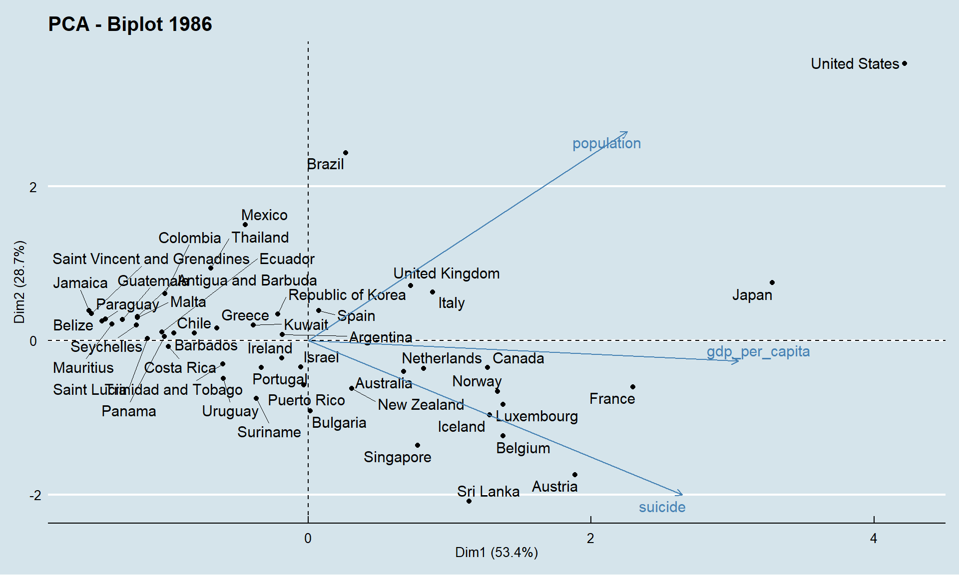
The first dimension explains 53% of the variability among the countries. It is positively influenced by the 3 variables, but GDP per capita has a stronger influence on this first dimension.
The second dimension explains 29% of information and is strongly influenced positively by the population and negatively by suicide.
These two axes allow us to say that a country whose coordinates are located to the right of this graph is a rich country. Similarly a country located at the top is a populated country. If the country is located at the bottom of the graph the higher is the proportion of suicide in that country.
5.2 In 2015
Let’s see how the situation of countries has changed in 29 years
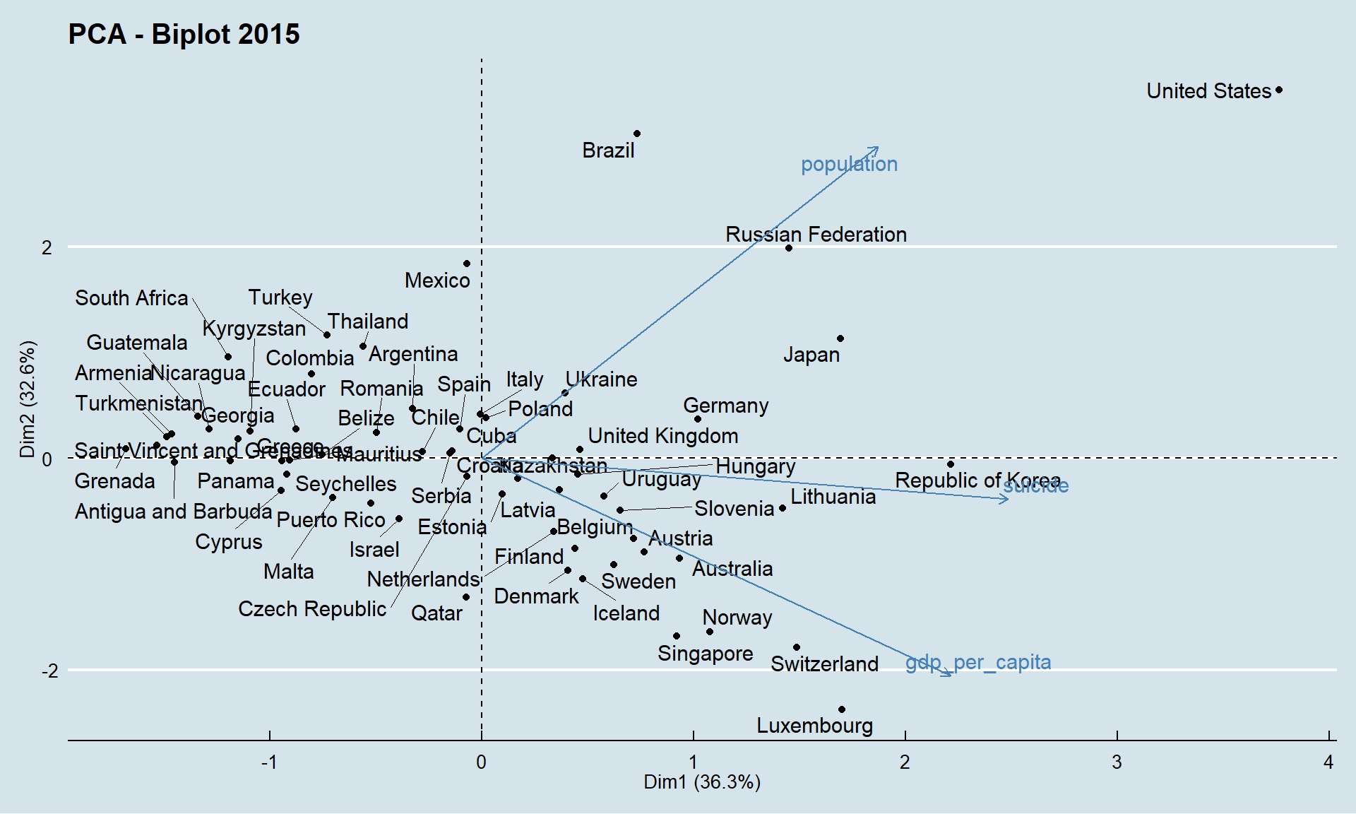
Compared to the results obtained in 1986, the two dimensions have about the same importance. Suicide is not as important as it was in 1986. The direcion of arrows has changed: the more a country is on the right, the higher its suicide rate. The countries on the top right are countries with a large population and a high suicide rate. While the countries at the bottom have a small population but a very high GDP per capita.